Overview
Happier Meditation, formally Ten Percent Happier approached Full Nelsen looking to support their upcoming redesign efforts with an equally beautiful updated app experience. The team had a single designer who had recently moved on to their next role so I took the lead on multiple design and marketing initiatives for multiple product owners and teams.
I provided the staff augmentation they needed at the right time to release meaningful UX upgrades with a fresh coat of paint.
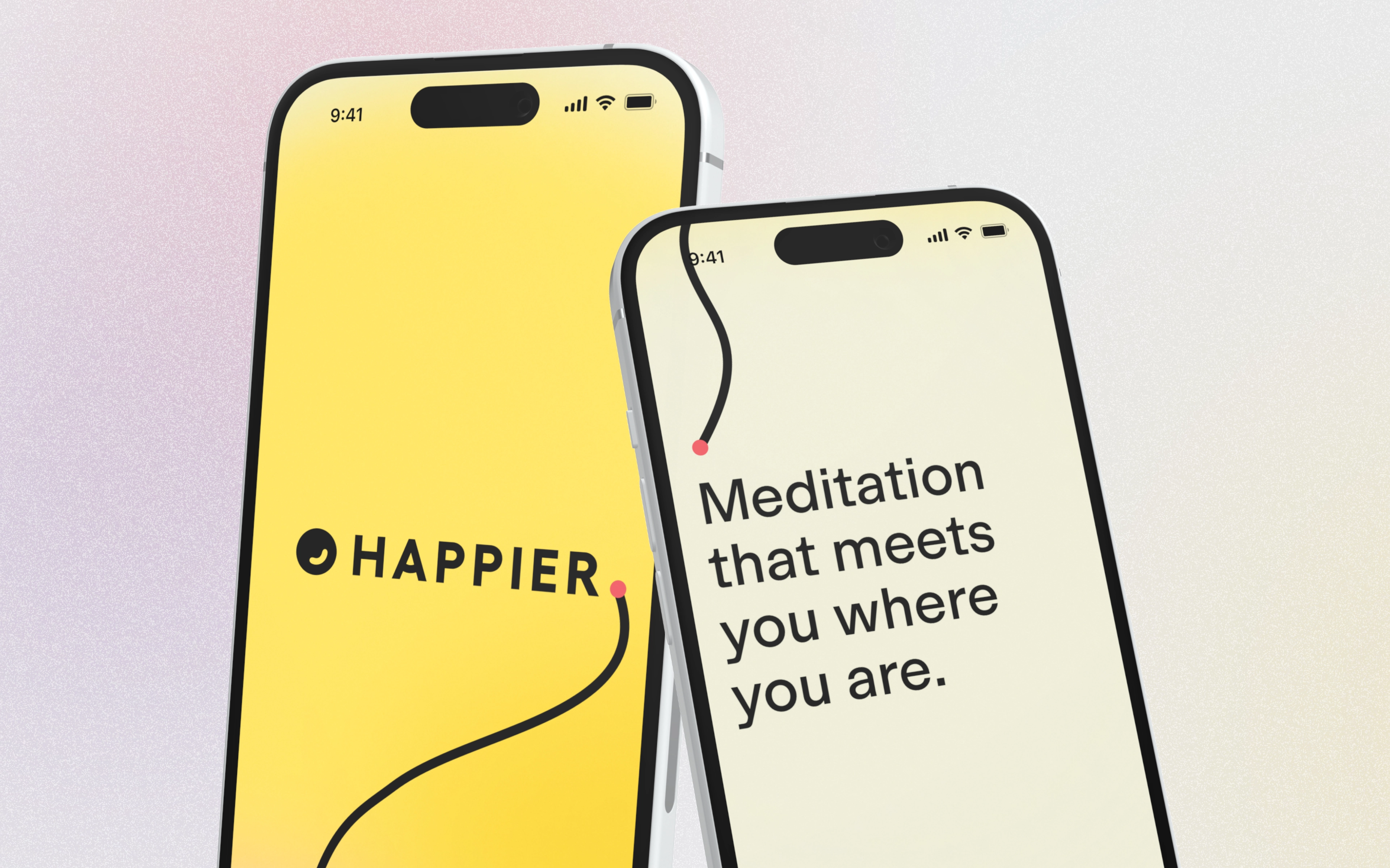
The first project I took on with a fabulous product ownerwas to explore a visual style that would match up cleanly with the new marketing site releasing soon. The brand evolved from red and black to a myriad of colors including a bright yellow, black and every sort of mesh gradient in-between. Happier coupled this with both relatable and unexpected lifestyle photography and witty writing.
This visual language, explored over multiple iterative rounds with the head of brand and marketing, evolved into a simple card deck system that would be the meditator's primary experience day-to-day in the app.
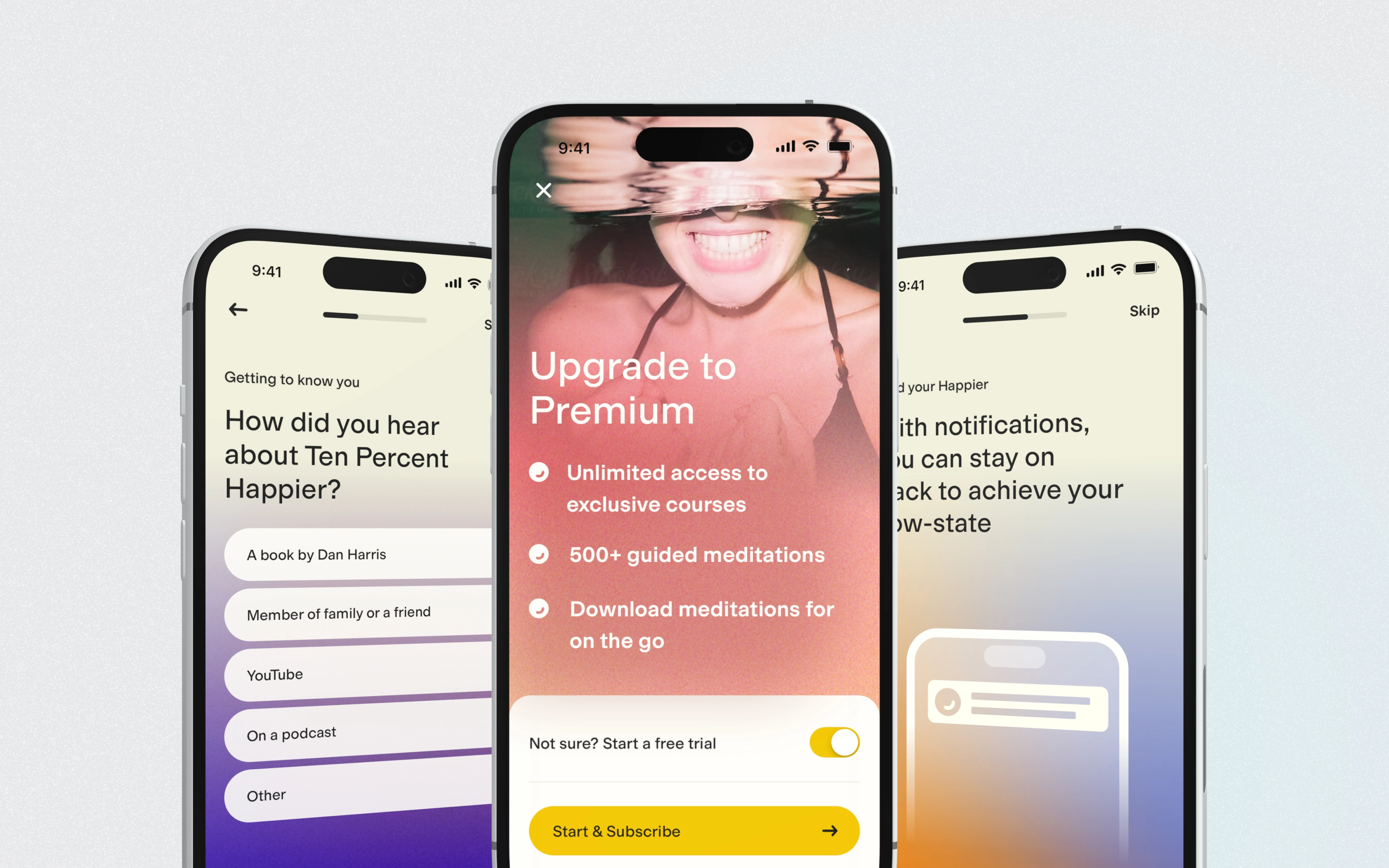
To improve and personalize the content (video, audio, reading, etc.) for the new mediators, we also completely revamped the onboarding flow with interesting questions and encouraging statements. Each screen flowed cleanly into the next and as part of this work I built an end-to-end prototype complete with transitions and animations to present to the larger product team.
This work would later inform some of the designs for user-acquisition and their blog.
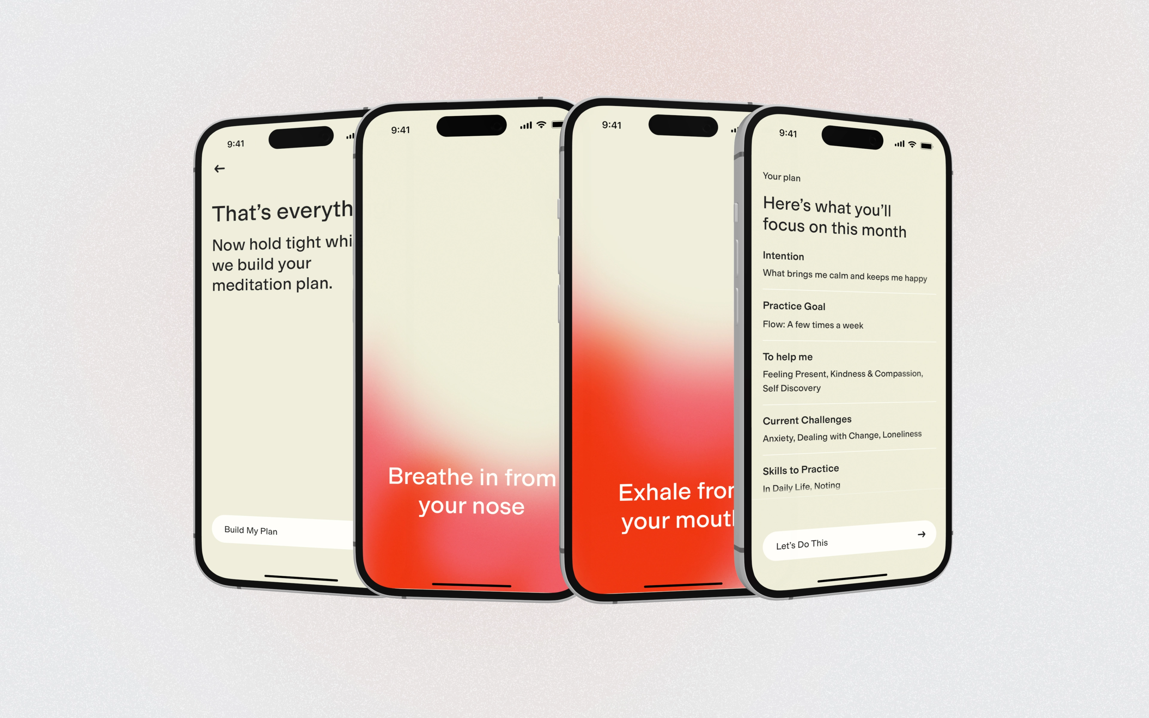
Building onboarding came up fast. I found myself in in San Francisco for a conference but was able to deconstruct the mesh gradient system for the lead engineer so they could build it programmatically, reducing the app size. This created a experience that felt dynamic and encouraged moving to each next step with subtle motion as well.
The Happier Meditationapp is a paid membership with access to exclusive courses taught by leaders in meditation, stress management, depression, etc. We optimized the onboarding to help multiple teams hit their targets and/or goals in addition to get the meditator coming back to continue their practice.
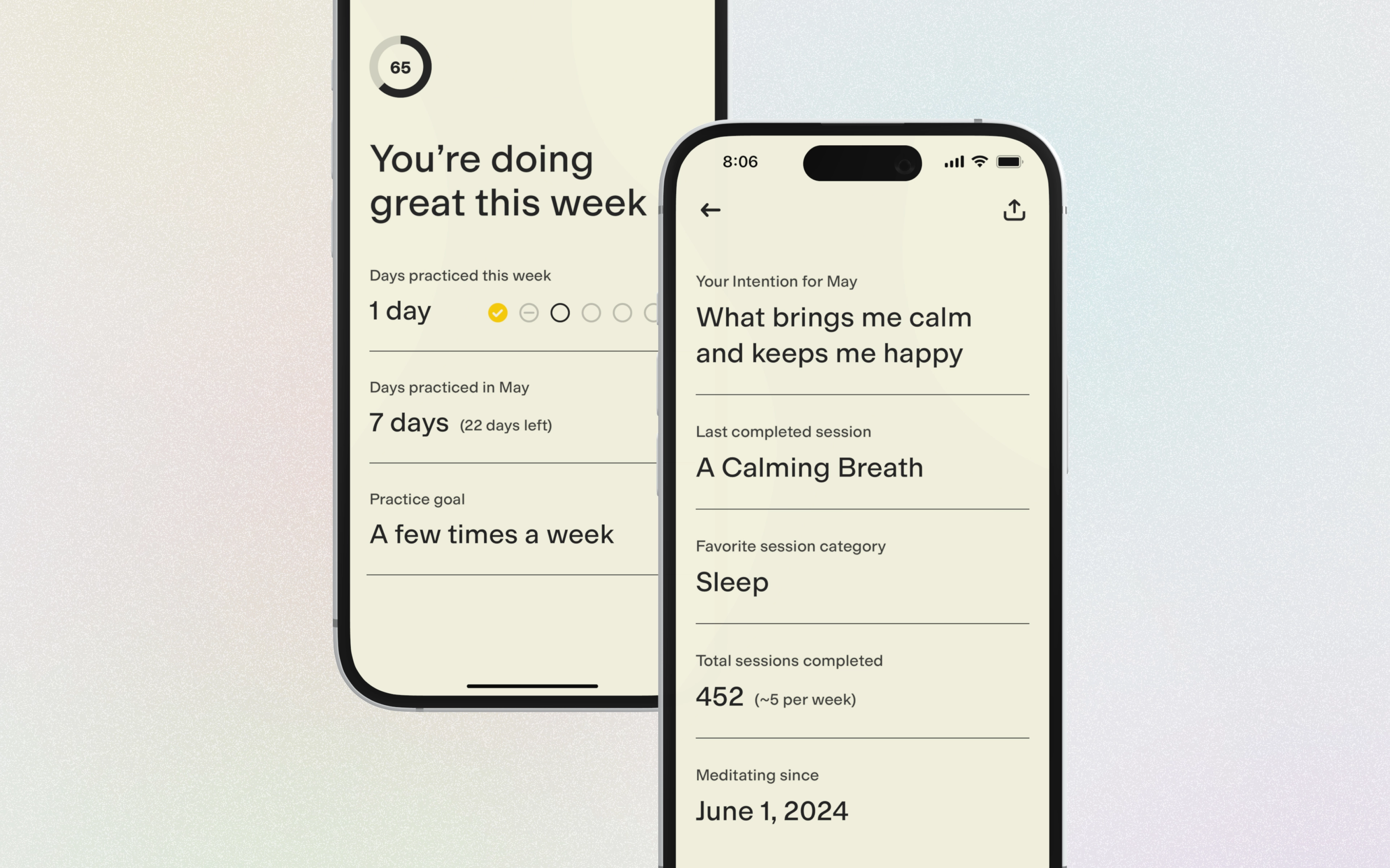
My second major project informed meditators of metrics to continue to update their intentions month-to-month and as life changes. I explored a variety of styles for progress indicators through sketches and example code.
I also drew inspiration from video games that track quest progress and stats to illustrate the meditator's growth in their practice and have something to show for their efforts.
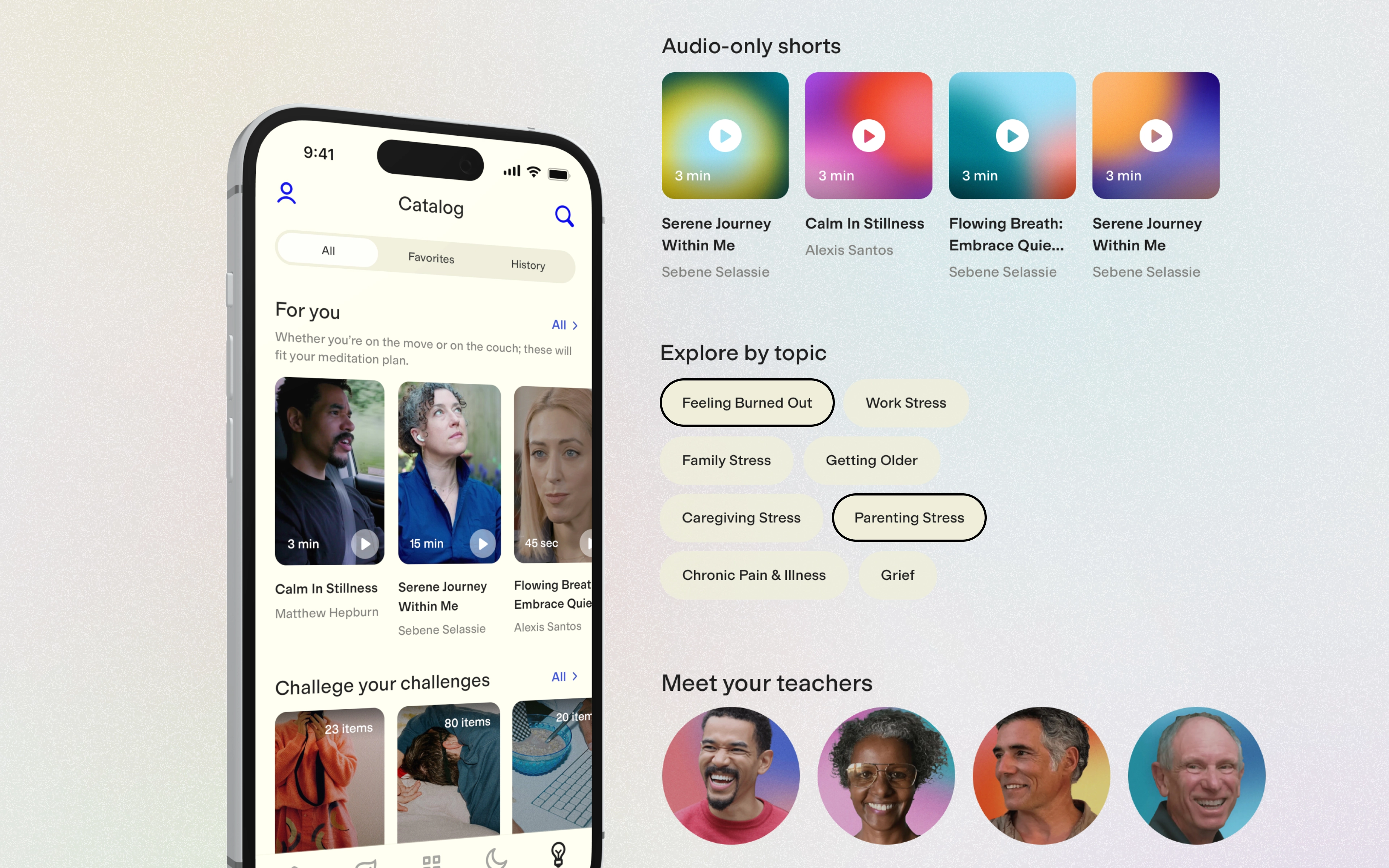
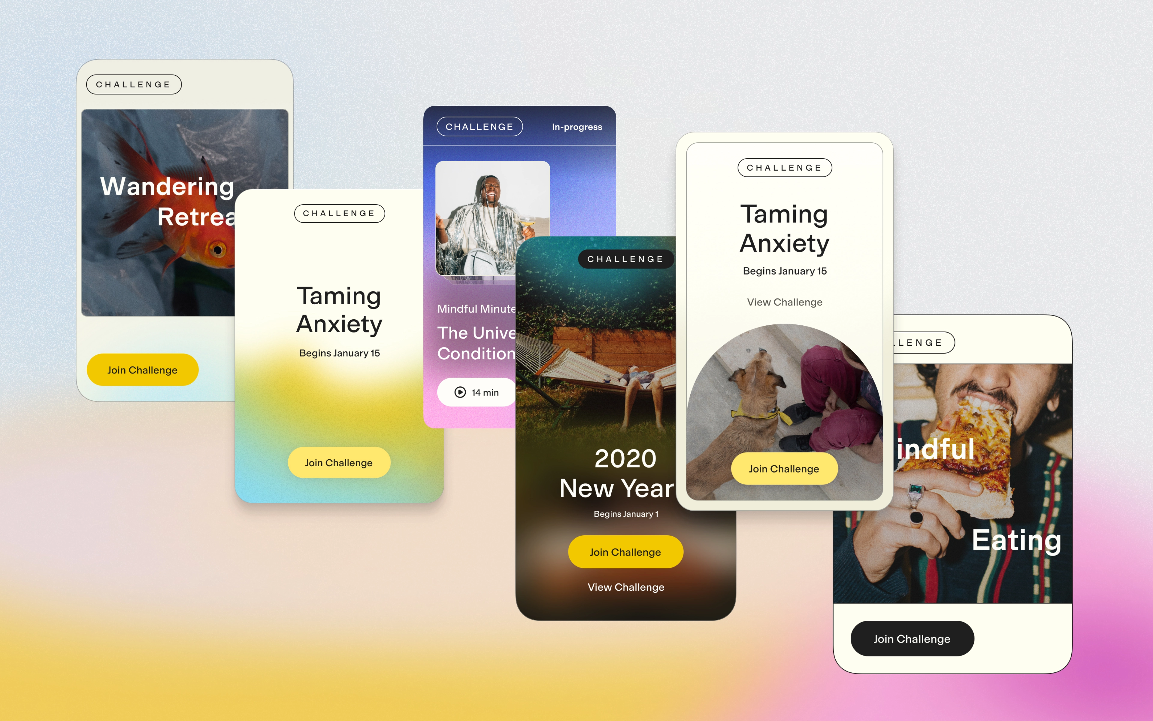
Another aspect of Happie Meditation that users interact with the most is podcasts. These are a combination of public and member-only feeds, but in addition to audio video was shot in more recent years. I took on the third project to transform their Podcast tab into a Catalog tab.
I continued to push the brand guide forward with this updated vertical video, audio, topic and teacher collections.
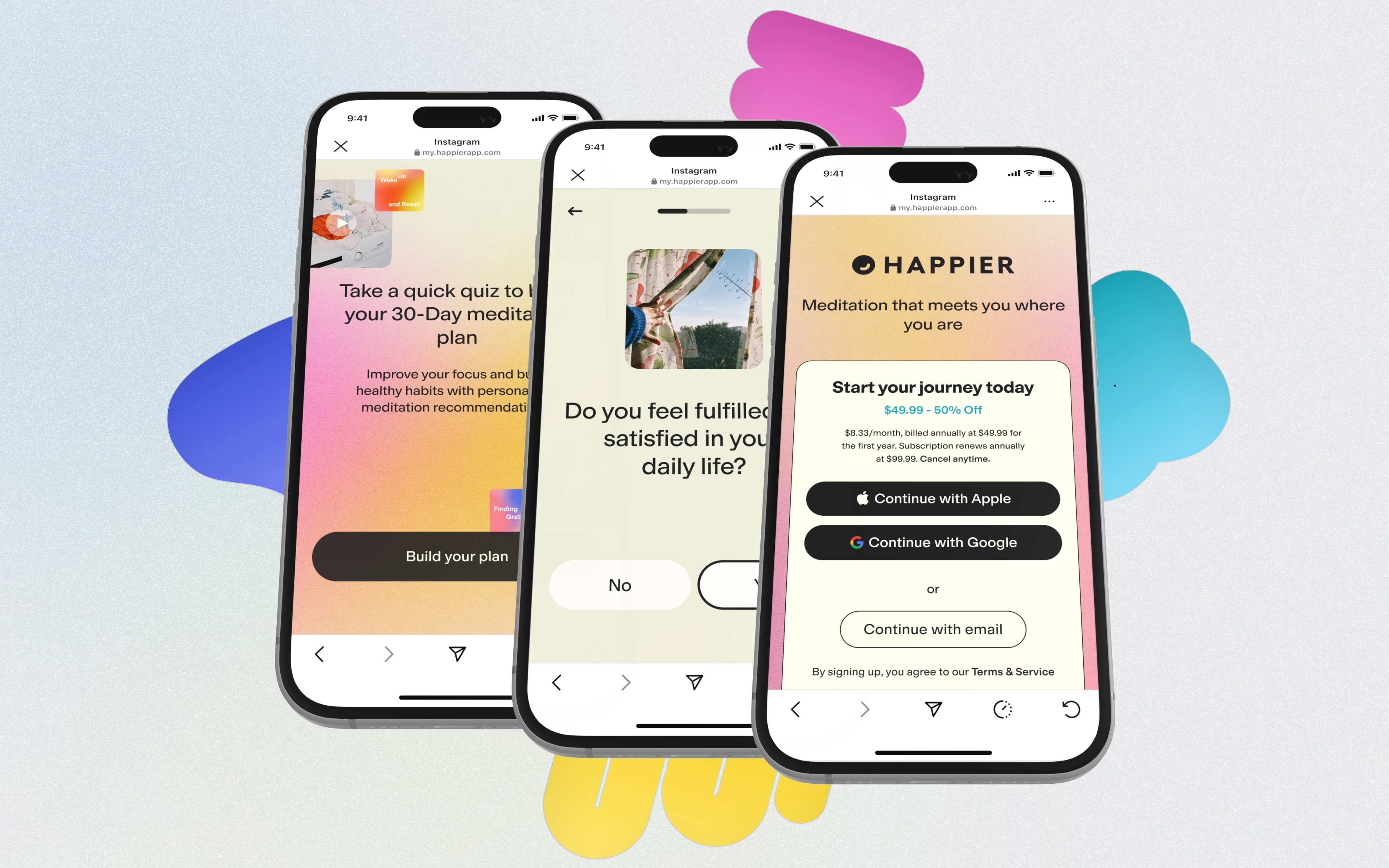
To tie everything together, I worked with another team to update the web-based acquisition flow used primarily on paid channels and social. I used the same approach as the onboarding to give a taste of the experience and worked on a fun off-shoot to identify what type of meditator you are (like your personality type).
Skills I acquired or improved
More advanced animation and implementation with Lottie
Async communication through Loom to get more reactions on work in the moment
Juggling multiple projects with multiple amazing product owners and personalities
Visual development hand-off in cross-sections to best represent the brand intentions